
Understanding Data Mining
| Author: | Celia Rowland |
| Level: | High School |
| Content Area: | Mathematics |
| Author: | Celia Rowland |
| Level: | High School |
| Content Area: | Mathematics |

AP Statistics students will use R to investigate the least squares linear regression model between two variables, the explanatory (input) variable and the response (output) variable. You will learn to identify which explanatory variable supports the strongest linear relationship with the response variable. You will examine data plots and residual plots for single-variable LSLR for goodness of fit. Residual plots will be examined for evidence of patterns that may indicate violation of underlying assumptions.
We will examine the bi-variate data set first to determine the linear relationship between two attributes of individuals or objects in a population. While it does not matter which variable is considered to be x when evaluating the strength of the relationship, it does matter when we establish the regression model. Remember that we routinely use x as the explanatory variable and y as the response variable. In R you may assign any name you so choose to your variables.
Recall that the LSLR line is written in the form y=α+ βx. If the explanatory variable is a perfect predictor of the response variable, then there will be no variation from the line. This is often not the case. The LSLR line is called the “line of best fit” because it minimizes the amount of variation or error of each observation from the fitted line. So the true model is written as y = α + βx + ε where ε represents the variation from the observed value of the response variable to the predicted value of the response variable. You should recognize those error terms as residuals.
SENIC is the Study on the Efficacy of Nosocomial Infection Control and its purpose was to determine whether infection surveillance and control programs have reduced the rates of nosocomial (hospital-acquired) infection in U.S. hospitals. This data set consists of 113 randomly selected hospitals from the original 338 hospitals surveyed. The statistics are either average values for the hospital for the study period or ratios for the hospital based on total frequency during the study period. None of these variables are categorical variables.
The headers for each column are:
Source: Applied Linear Statistical Models, 3rd ed, Neter, J., Wasserman, W., Kutner, M. (Boston, 1990) Appendix B
senic<-read.table(“senic.dat”, header = T)
senic
If you don’t get a data dump, then the data file is not correctly loaded in R’s working directory.
stay← senic$Stay
risk← senic$Risk
age←senic$Age
lab←senic$Culture
xray←senic$X.Ray
beds←senic$Beds
These shortened names will make it easier to work within the lab.
We will begin this exercise by plotting the data set using the plot() command:
plot(filename$variable1, filename$variable2)
Because we already shortened the names, use this command:
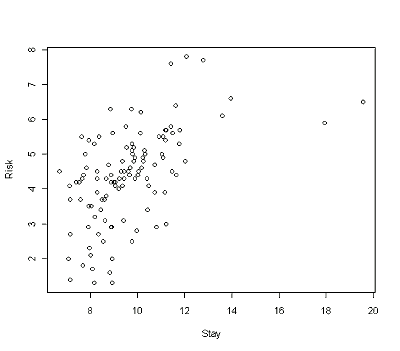
plot(stay, risk)
Remember that your plot should have the response variable along the vertical axis and the explanatory variable along the horizontal axis. R will automatically fit the data scale for each axis for all plots.
Your plot should look like the one below.
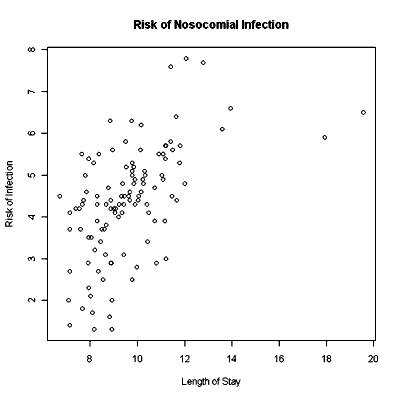
Note that the output includes labels on the x- and y-axis in the same format as the variables you used in the plot command. If you want to change those labels, you can do so and make them more relevant to the data set. You can add a heading to the graph as well. All of this can be done at one time with the plot command.
plot(stay, risk, xlab=”Length of stay”, ylab=”Risk of infection”, main=”Risk of Nosocomial Infection”)
Here, xlab is the x-axis label and ylab is the y-axis label. The header for the graph is created with the main command. The labels and header are all entered with double quote marks.
A more professional-looking scatterplot is on the next page.
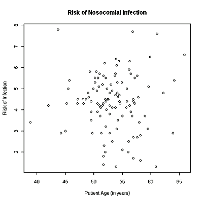
For practice create at least two scatterplots with different explanatory variables from the data set. Be sure to put in full labels for the axes and the header. If you wish to keep your plot, you can right-click on the plot and copy as bitmap. Then paste the graph into Word and save your Word file. The first scatterplot should look like this one:
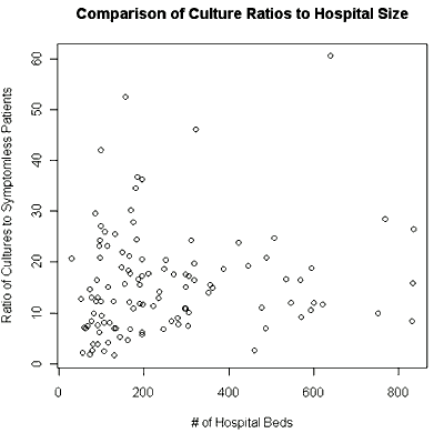
And the second plot should look like this one:
Next you will run a simple linear regression with two variables from this data set. You want to find a predictor for the risk of hospital-acquired infection, the variable Risk from the SENIC data set. You can consider Length, Age, Lab, Chest or Beds for the explanatory variable. You have already created a scatterplot of Risk vs Length (of stay) in the first plot and it looks roughly linear, so let’s examine this relationship.
The command for simple linear regression is lm(response variable~explanatory variable).
lm(risk~stay)
Here is the output from that command:
Coefficients:
(Intercept) stay
0.7437 0.3742
How would you interpret this output? ____________________________________________________________________
What is the equation of the LSLR?__________________________________________________________________________
Let’s called this model1. Run the command to create model1:
model1< lm(risk~stay)
Then type the command model1$fitted.values
What do these numbers represent?
       1        2        3        4        5        6        7        8
3.411654 4.044034 3.864423 4.092679 4.934605 4.395772 4.365837 4.927122
       9       10       11       12       13       14       15       16
3.987906 4.051518 4.885961 3.849456 5.525825 3.580039 4.111388 4.889703
      17       18       19       20       21       22       23       24
3.841972 5.091765 4.133840 4.242355 3.561330 4.575383 4.403256 4.425707
      25       26       27       28       29       30       31       32
4.186226 3.841972 4.227387 3.808295 5.102991 4.444417 4.870993 4.425707
      33       34       35       36       37       38       39       40
5.147893 5.828918 4.388289 4.609060 4.474352 3.677328 4.661447 3.797069
      41       42       43       44       45       46       47       48
3.916810 4.754994 4.934605 4.530481 3.875649 4.545448 8.062830 4.822348
      49       50       51       52       53       54       55       56
3.613716 4.066485 5.039378 4.197452 5.013185 5.260150 3.972938 4.915896
      57       58       59       60       61       62       63       64
3.415396 3.606232 4.758736 5.031895 4.642737 4.927122 3.711005 4.358353
      65       66       67       68       69       70       71       72
3.654877 4.268548 4.493062 3.954229 4.339644 3.748424 3.508943 3.392944
      73       74       75       76       77       78       79       80
4.309709 4.504287 3.905584 3.250752 4.073969 4.571641 4.066485 4.597835
      81       82       83       84       85       86       87       88
4.781188 3.714747 3.598749 4.025325 3.770876 4.130098 3.703522 4.631512
      89       90       91       92       93       94       95       96
4.246096 5.013185 4.059002 4.085195 4.081453 3.793327 4.399514 3.939261
      97       98       99      100      101      102      103      104
3.984164 5.237699 3.718489 4.541706 4.395772 4.444417 3.415396 5.963627
     105      106      107      108      109      110      111      112
4.276032 4.784929 3.415396 3.744682 5.159119 4.298483 3.624942 7.456643
     113
4.264806
These values are the predicted y-values ( y ) based on the LSLR! Let’s shorten the predicted y-values to yfit:
yfit<-model1$fitted.values
Before you can plot the line of the model onto a scatterplot, you must have the scatterplot available.
plot(stay, risk)
To plot the model onto the scatterplot use the command:
lines(stay, yfit)
Your output should look like the graph below.
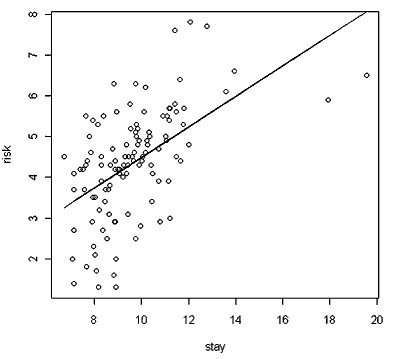
Well, it looks roughly linear. Let’s examine the residual plot. Remember that a residual is the difference between the observed value for y at some particular x and the predicted value for y at that same x value.
Residual = A−A.
The y-values here are the values of Risk and the predicted values are the values associated with yfit . Define the variable resid as outlined below, then plot the x-variable against the residual.
resid←risk – yfit
plot(stay, resid)
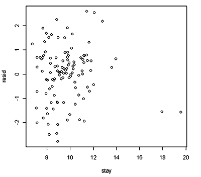
So…does the residual plot tell you anything? Describe here what you see in the graph.
Lastly, let’s look at the correlation coefficient for this particular model:
cor(stay, risk)
What value did you get for r? How would you interpret this value in the context of the problem?
Address: Campus Box 7006. Raleigh, NC 27695 Telephone: 919.515.5118 Fax: 919.515.5831 E-Mail: KenanFellows@NCSU.edu